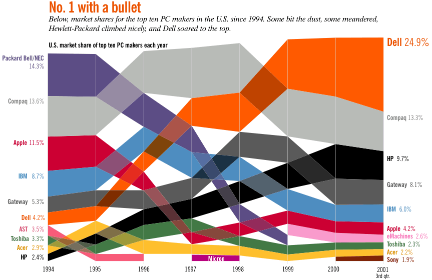
This PC market share chart combines a fever line with
a layered bar
to show movement and size simultaneously. This chart received much feedback (positive, for a change) from readers. In fact, Steve Jobs
requested a PDF for use in a presentation.
to show movement and size simultaneously. This chart received much feedback (positive, for a change) from readers. In fact, Steve Jobs
requested a PDF for use in a presentation.